What a Brand Style Guide Should Include (and Why Small Businesses Need One)
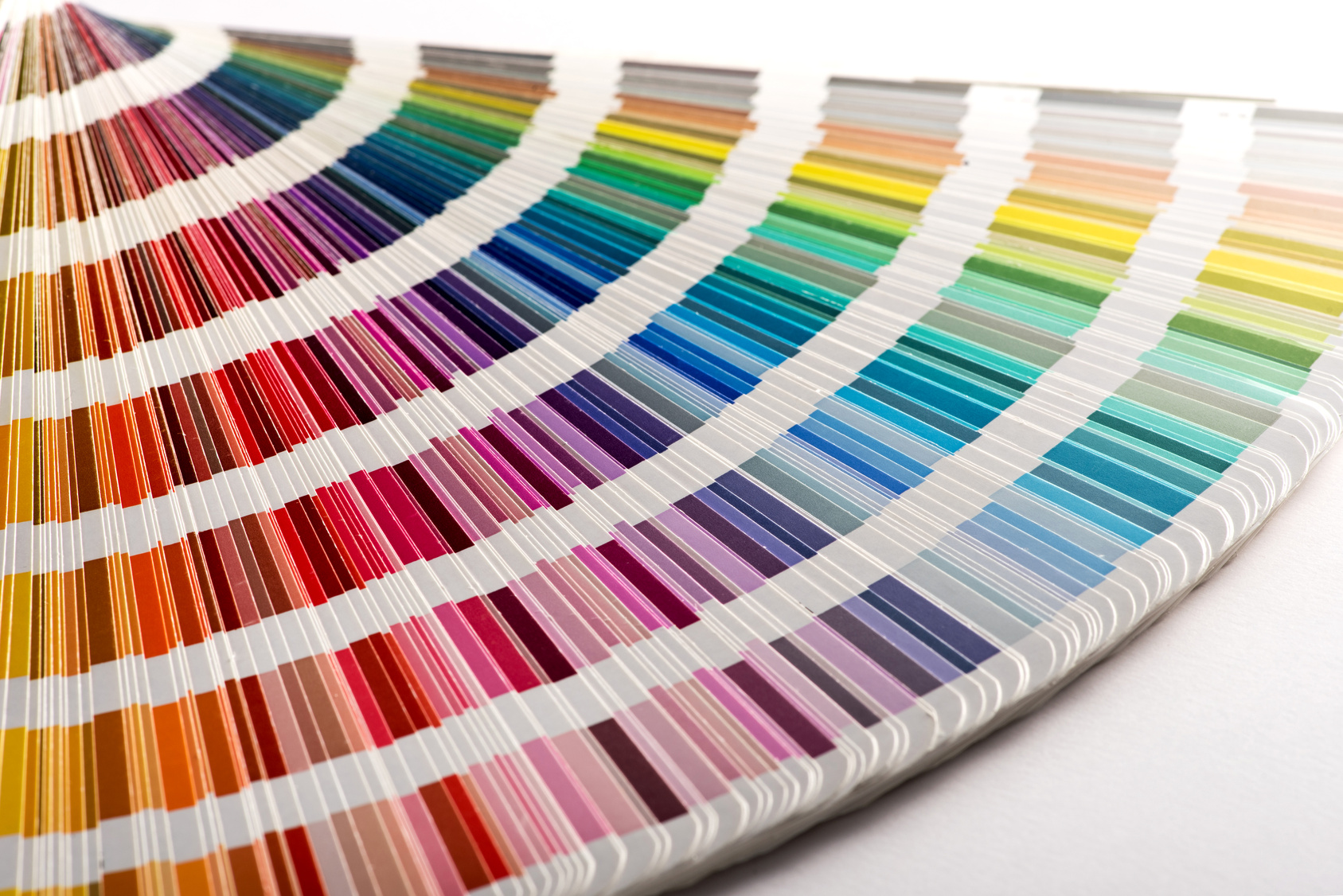
A brand style guide is a short document that tells anyone working on your brand exactly how to use your logo, colors, fonts, photos, and words. For a small business, it should cover logo versions and spacing, color codes for screen and print, type choices, photo style, voice rules, readable color pairs, and where the files live.
Key takeaways
- Ten to fifteen pages is enough. A guide people actually open beats a thick binder nobody reads.
- List exact color codes and check that text colors meet WCAG contrast ratios before they reach your website.
- Store every logo file in the formats designers, web developers, and sign shops will ask for.
What is a brand style guide?
A brand style guide is the rulebook for how your business looks and sounds. It records decisions you already made about your logo, colors, fonts, images, and voice, so other people can repeat them without guessing. It is a reference tool, not a design project. Its job is to keep your brand the same across every place it appears.
You may hear other names for it: brand guidelines, brand book, or brand standards. Larger companies often go further and build a design system. Nielsen Norman Group describes a design system as "a complete set of standards intended to manage design at scale using reusable components and patterns," and treats the style guide as one part of that system, focused on things like colors, typography, logos, and tone of voice.
A small business rarely needs a full design system. It does need the style guide part.
Why does a small business need a style guide?
A style guide saves money and protects recognition. Without one, each designer, printer, and web developer guesses at your colors and logo use, and the results drift apart. You then pay to fix mismatched trucks, signs, and pages. With a guide, new vendors get it right the first time and customers recognize you faster.
Small businesses feel this more than big ones because they work with many outside vendors and few in-house designers. A typical service company might use a sign shop, a vehicle wrap installer, a print shop, a web designer, a social media freelancer, and an embroidery shop for uniforms. Each one starts from whatever files you hand them.
A guide also speeds up hiring. When you post a job, a clear guide lets freelancers quote accurately because they know what rules they must follow. It also cuts revision rounds, which is where small design budgets usually disappear.
What should a brand style guide include?
A useful small business style guide has seven sections: logo, color, typography, photography and imagery, voice and tone, accessibility rules, and file locations. Each section answers the questions vendors ask most. Keep each one to one or two pages, with examples of right and wrong use wherever you can.
Here is a template you can follow. Fill in the right column with your own decisions.
| Section | What to include | Questions it answers |
|---|---|---|
| Logo | Primary logo, simplified mark, one-color version, clear space, minimum size, "do not" examples | Which logo goes on a shirt? How small can it be? Can I put it on a photo? |
| Color | Primary and accent colors with HEX, RGB, CMYK, and Pantone (if used); approved text and background pairs | What blue exactly? Which colors can text sit on? |
| Typography | Heading font, body font, weights, sizes for web and print, fallback fonts | Which font for a flyer headline? What if the font is not installed? |
| Photography | Style description, subject list, example photos, what to avoid | Should photos show real staff? Bright or moody? Stock allowed? |
| Voice and tone | Brand promise, three to five voice rules, words to use and avoid | How formal? Do we use jargon? How do we describe our service? |
| Accessibility | Contrast-checked color pairs, minimum text sizes, alt text basics | Is this text readable? Will this pass a contrast check? |
| Files and contacts | Link to shared folder, file naming rules, who approves new uses | Where is the vector logo? Who signs off? |
How should you document your logo?
Show every approved version of your logo, the space it needs around it, the smallest size it can appear, and a few examples of misuse. Most small businesses need a full-color primary logo, a simpler mark for small spaces, and single-color versions in dark and light. That set covers websites, uniforms, stamps, and vehicle wraps.
- Clear space. Define a margin around the logo where nothing else can go. A common method is to use a part of the logo, such as the height of a letter, as the measuring unit.
- Minimum size. Give a minimum width in pixels for screens and in inches or millimeters for print. Below that size, switch to the simplified mark.
- Backgrounds. Show which version goes on light backgrounds, dark backgrounds, and photos.
- Do not. Show the logo stretched, recolored, rotated, outlined, or with added effects, each marked as wrong. Pictures of mistakes teach faster than rules.
How do you list brand colors correctly?
List each color with exact codes for every medium: HEX and RGB for screens, CMYK for printed pieces, and a Pantone reference if you print signs, shirts, or promotional items. Then add the approved text-and-background pairs. Exact codes stop vendors from matching your color by eye, which is how brands slowly shift shade over the years.
Organize colors by role, not just by name. For example:
- Primary. Your main brand color, used for the logo and key headings.
- Accent. One color for buttons and calls to action, so they stand out.
- Neutrals. Dark text color, light background color, and one or two grays.
Screen colors and printed colors are created differently, so the same color can look slightly different on paper. Ask your printer for a proof before a large run, and note the approved print values in the guide once you are happy with them.
Why do color contrast rules belong in your style guide?
Contrast rules make sure people can actually read your text. The Web Content Accessibility Guidelines (WCAG 2) ask for a contrast ratio of at least 4.5 to 1 for normal text and 3 to 1 for large text. Writing approved color pairs into your guide stops designers from putting light gray text on white or white text on yellow.
This is one of the most common problems on the web. WebAIM's 2026 analysis of the top one million home pages found low-contrast text on 83.9 percent of them, with an average of 34 distinct instances per page.
The key WCAG numbers to put in your guide:
- Normal text: at least 4.5 to 1 against its background (Success Criterion 1.4.3).
- Large text: at least 3 to 1. WCAG defines large text as at least 18 point, or 14 point bold.
- Buttons, form fields, and icons that carry meaning: at least 3 to 1 against neighboring colors (Success Criterion 1.4.11).
- Logos: WCAG says text that is part of a logo or brand name has no contrast requirement. Everything around the logo still does.
Run each of your text and background pairs through a free contrast checker and list only the pairs that pass. If your favorite brand color fails with white text, keep it for shapes and backgrounds and use a darker shade for text.
What file formats should your style guide list?
List the file formats each type of vendor needs and where to find them. Web developers want SVG logos and web-ready images. Office staff need PNG files with transparent backgrounds. Print shops and sign makers usually ask for vector files such as PDF, EPS, or AI. Name files clearly so nobody grabs the wrong version.
Mozilla's web documentation (MDN) describes SVG as a vector format that "will smoothly scale to the desired size," which makes it a strong choice for logos and icons on websites. For raster images, MDN recommends lossless formats like PNG for "screenshots, diagrams, logos, and line art," and notes that JPEG is "particularly useful for photographs" but does not support transparency.
| Format | Best for | Who asks for it |
|---|---|---|
| SVG | Logos and icons on websites; scales without blurring | Web designers and developers |
| PNG (transparent) | Logos in documents, slides, email signatures | Office staff, social media freelancers |
| JPEG or WebP | Photographs on websites and social posts | Web and social freelancers |
| PDF, EPS, or AI (vector) | Signs, vehicle wraps, printed pieces, embroidery prep | Print shops, sign makers, wrap installers |
Use a simple naming pattern, such as brandname-logo-primary-color.svg and brandname-logo-white.png. Keep everything in one shared folder and link to it from the guide.
How do freelancers and vendors use a style guide?
Freelancers use a style guide to start fast and avoid guesswork. A designer checks it for colors and fonts before opening a file. A copywriter reads the voice section. A sign shop pulls the vector logo and print colors. When the guide is clear, first drafts land closer to right and revision rounds shrink.
A few tips for working with outside help:
- Send the guide with the job post or the brief, not after the first draft.
- Ask freelancers to flag anything the guide does not cover for their job. Their questions show you what to add.
- Require source files for anything they create, and add new approved assets to your shared folder.
- Name one person who approves brand use, so vendors are not waiting on several opinions.
Also check font licenses. Some fonts are free for any use, while others need a paid license for websites, apps, or logos. Note the license type in your guide so a vendor does not install something you are not allowed to use.
How do you build a style guide if you do not have one?
Gather what you already use, pick the best version of each element, and write it down. Collect your logo files, sample printed pieces, your website colors, and a few good photos. Decide what is official, fill in the template table above, and save it as an editable document plus a PDF. A first version can be done in a day.
- Collect every logo file you can find. Keep the highest-quality vector version.
- Pull exact color codes from your website or your original logo files rather than matching by eye.
- Check text and background pairs against WCAG contrast ratios.
- Pick two fonts and note where each is used.
- Write a short photo description and pick three to five example images.
- Add your brand promise and voice rules.
- Put everything in a shared folder and share the link with your team and vendors.
If your logo files are low quality or missing, that is the moment to bring in a designer to rebuild them as vectors before you write the guide.
Frequently asked questions
How long should a small business style guide be?
Most small businesses need ten to fifteen pages. Cover logo, colors, fonts, photos, voice, contrast rules, and file locations, with examples of right and wrong use. Longer guides tend to go unread. If a section grows past two pages, move the detail into a separate file and link to it from the main guide.
Is a brand style guide the same as a logo?
No. A logo is one piece of your brand. A style guide explains how to use the logo along with everything around it: colors, fonts, photos, and the way you write. Many designers include a basic guide with a logo project, but it often covers only the logo and colors, so expect to add the rest.
Do I need a style guide if I only have one designer?
Yes. Designers change jobs, get busy, or retire, and a new one will need the same answers. A written guide also helps everyone who is not a designer, such as office staff making flyers, a sign shop, or a uniform supplier. It keeps the brand consistent no matter who touches it next.
What contrast ratio should my brand colors meet?
For readable websites, WCAG 2 asks for at least 4.5 to 1 between normal text and its background, and 3 to 1 for large text and for buttons, form fields, and meaningful icons. Logo text is exempt. Test each color pair with a free contrast checker and list only the pairs that pass in your guide.
Should my style guide include social media rules?
Include a short section if you post often. Note your profile image, cover image sizes, the fonts and colors for graphics, how you use photos, and voice rules for captions and replies. Platform sizes change, so link to each platform's current specs instead of hard-coding numbers that may go out of date.
The bottom line
A style guide does not make your brand. It protects the brand you already built. Write down your logo rules, exact colors, fonts, photo style, and voice, check that your colors are readable, and keep every file in one shared folder. Then send it to every vendor before they start. If you want a second set of eyes on yours, Book a free call with Mike or run the free 60-second check to see how search and AI tools describe your business today.
Sources
- Nielsen Norman Group: Design Systems 101 (Therese Fessenden)
- W3C: Understanding Success Criterion 1.4.3 Contrast (Minimum)
- W3C: Understanding Success Criterion 1.4.11 Non-text Contrast
- WebAIM: The WebAIM Million, 2026 report on the accessibility of the top 1,000,000 home pages
- MDN Web Docs: Image file type and format guide
Keep reading